

Faber Modern Classics of 1929 heritage will be launching ten new designs of their classic paperback books in April 2015, followed by another six in June, below are the first of the new designs. The series, “…Will bring together its different strands, including fiction, non-fiction, poetry and drama.” explains FF online.
The grid structure though conveys information clearly I feel should have been devised with much more complexity. Enabling the designer to work with the different format images and the band of colour in a more unique fashion, using patterns, lines, borders and curved shapes reflecting the author, writing styles and the era, secondly, there’s the photographs, typographic designs and illustration to consider. Both aspects have to work in conjunction with each other. The typographic headings are set using the font Helvetica for the 2015 publication, though admitting it is a classic font, surely we are getting a little tired of it since the self-titled Gary Hustwit documentary film 2007. It is too overused whereas a classic book is accepted as exemplary and noteworthy. Therefore, not to be confused with the iconic font most known in New York’s subway.
I do like the way the band of colour that has a translucence overlay on to each image that carefully references the brand’s heritage, and the author's previous printed editions. As I mentioned previously the layout could have been more creative and far less uniform. Faber and Faber’s very strong art deco identity combined with the heritage colours I feel would have produced enough design consistency throughout this series.
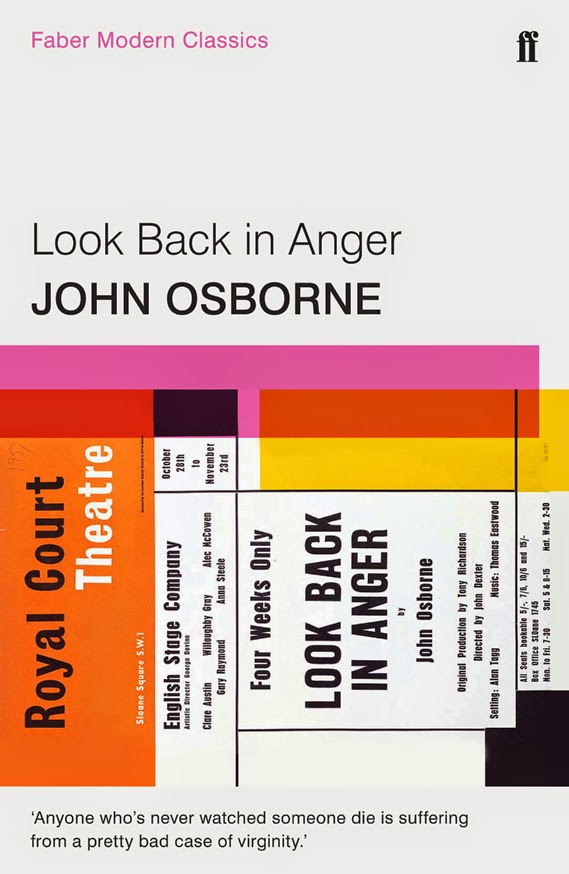
The mix of illustrations and photography is good, but the cropping of the images has made the images seem somewhat formulaic though undoubtedly they do reflect the spirit of the times, here the format works best with the Sylvia Plath and John Osborne covers.
The pulled quotes are marvellous and are very well chosen. It’s surprising how well they fit with the images and yet the formatting feels a little detached from them. I think that I have mixed feelings towards this series because I love classic literature, and I also greatly admire other cover designs published by Faber and Faber. The Poetry Essentials box set is wonderful!


Nightwood by Djuna Barnes with introductions from Jeannette Winterson and T S Eliot
Ariel by Sylvia Plath (chosen by Edna O'Brien)
Pincher Martin by William Golding with an afterword by Phillipa Gregory
The Buddha of Suburbia by Hanif Kureishi with an introduction by Zadie Smith
Self-Help by Lorrie Moore
Housekeeping by Marilynne Robinson (selected by Barbara Kingsolver)
Venice by Jan Morris
Selected Poems by T S Eliot featuring an essay by Seamus Heaney
Look Back in Anger by John Osborne with an introduction from Michael Billington and an afterword by David Hare
The Remains of the Day by Kazuo Ishiguro
Faber Modern Classics
No comments:
Post a Comment