author

By Nina J P Evans

Thursday, October 23, 2014

Studies of Deco Architecture


These black and white photographs are detailed compositional studies beautifully showcasing the style and extravaganza of deco taken in and around New York. I greatly admire the way the photographer has captured the contrast between the softness of some of the brickwork and statuesque forms, to the geometric high key patterns and structural designs, they delightfully epitomise the glamour and sophistication.

It’s not surprising that I’m so inspired by these images tonight as I am watching Irving Berlin’s classic musical Top Hat staring the indomitable Fred Astaire.


Steven Heller Explains about more about the Deco period in America and Paris. In a piece titled Deco details in New York.


Wednesday, October 22, 2014

Faber Modern Classics


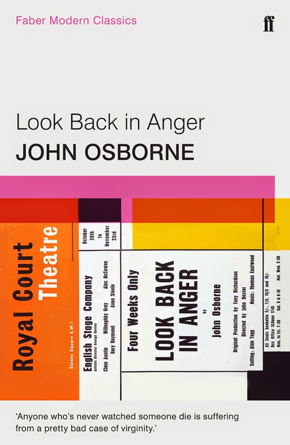
Faber Modern Classics of 1929 heritage will be launching ten new designs of their classic paperback books in April 2015, followed by another six in June, below are the first of the new designs. The series, “…Will bring together its different strands, including fiction, non-fiction, poetry and drama.” explains FF online.

The grid structure though conveys information clearly I feel should have been devised with much more complexity. Enabling the designer to work with the different format images and the band of colour in a more unique fashion, using patterns, lines, borders and curved shapes reflecting the author, writing styles and the era, secondly, there’s the photographs, typographic designs and illustration to consider. Both aspects have to work in conjunction with each other. The typographic headings are set using the font Helvetica for the 2015 publication, though admitting it is a classic font, surely we are getting a little tired of it since the self-titled Gary Hustwit documentary film 2007. It is too overused whereas a classic book is accepted as exemplary and noteworthy. Therefore, not to be confused with the iconic font most known in New York’s subway. 

I do like the way the band of colour that has a translucence overlay on to each image that carefully references the brand’s heritage, and the author's previous printed editions. As I mentioned previously the layout could have been more creative and far less uniform. Faber and Faber’s very strong art deco identity combined with the heritage colours I feel would have produced enough design consistency throughout this series.

The mix of illustrations and photography is good, but the cropping of the images has made the images seem somewhat formulaic though undoubtedly they do reflect the spirit of the times, here the format works best with the Sylvia Plath and John Osborne covers. 

The pulled quotes are marvellous and are very well chosen. It’s surprising how well they fit with the images and yet the formatting feels a little detached from them. I think that I have mixed feelings towards this series because I love classic literature, and I also greatly admire other cover designs published by Faber and Faber. The Poetry Essentials box set is wonderful!


The first ten titles in the series are:

Nightwood by Djuna Barnes with introductions from Jeannette Winterson and T S Eliot
Ariel by Sylvia Plath (chosen by Edna O'Brien)
Pincher Martin by William Golding with an afterword by Phillipa Gregory
The Buddha of Suburbia by Hanif Kureishi with an introduction by Zadie Smith
Self-Help by Lorrie Moore
Housekeeping by Marilynne Robinson (selected by Barbara Kingsolver)
Venice by Jan Morris
Selected Poems by T S Eliot featuring an essay by Seamus Heaney
Look Back in Anger by John Osborne with an introduction from Michael Billington and an afterword by David Hare
The Remains of the Day by Kazuo Ishiguro

Faber Modern Classics

Monday, October 20, 2014

New York, New York


Bob Eckstein clearly loves books, this illustrative sequence is a commission by The New Yorker to basically draw his favourite bookstores, with each he creates a dialogue; often with a star attraction. They are composed of a typical street scene with urbanites and traffic drifting past, and some people stopping to look in as you do. All showing the colourful array of books reflecting in the large plate glass double fronted windows with the slightest suggestion of the layout inside. The narratives feature many recorded frank and funny moments. He’s chosen famous people worth mentioning like Madonna and Sean Penn, Robin Williams, Philip Roth and Liza Minnelli who collide with punk kid fans, blackouts and explosions and daggers, daggers in the visual sense of the word. However, what touches mostly is the kindness of strangers. After a nearby asbestos explosion, customers exited the store in a panic without paying for their books. A few days later some customers returned and paid for the books they had fled with. I hope you enjoy this series as much as I did.


Bob Eckstein The New Yorker

Saturday, October 04, 2014

Yuko Yamamoto's paper craft illustrations


Yuko Yamamoto’s illustrations are stylish and sophisticated; her choices of colour and layout appear to look effortless. She works in collage, paper cutting, drawing, and watercolour. There is a very feminine quality to her portfolio online, due to the subjects she chooses to illustrate and her beautifully balanced; and thought out colour combinations.

I first got directed to her site with a link to her paper cuts, on the first page of images she adorns herself in the soft white foliage of her designs, a promising start I thought, on the next linked page more portfolio were pieces exhibited, I discovered that the paper cuts were not getting more intricately complex by either method or composition. Throughout her series of pieces, was the organic nature of her designs and the use of the camera to better showcase them. Her photographs compositions were as vital as the work itself, using shadows and lighting techniques and placement, using curved objects such as a studio chair, it’s interesting seeing how the piece of delicate 2D design falls softly into the 3D object.

Her pencil drawings have the same flair and style as the subjects she illustrates, again there is a simplicity and elegance of line. Her drawings of the shop fronts Chanel and Mui Mui added a touch of class.

The illustrative collages I think I liked best because of her combined skills of paper crafting with a playful sense of colour. There was an appealing vintage theme throughout her designs, best seen with the illustration of objects such as an SLR camera, a screw-top pepper pot and a key which might fit an old French chateau, I’d very much like to imagine.

Though she is a Japanese illustrator with an innate compositional sense, her illustrations are inspired by a French vintage style from the 1920s onwards. Everything is artfully composed, the way she photographed her paper cut designs was an interesting two-step process. As appealing as her work is I am yearning to see a more conceptual approach to her designs. However, what is absolutely apparent is the high-end presentation of all her creative pieces.


Friday, October 03, 2014

Birds I've Been

After considering the personal and collective thoughts, in the book titled Working On My #Novel, I decided Maude White’s exquisitely beautiful hand carved paper art would be perfect to showcase. She explains the concept behind her artworks as follows: “Birds I’ve Been is a new series of cut paper art that examines both women and birds; as observers witnessing the intimacy and action of others, and as participants experiencing and processing events.”

Firstly, I find it interesting that the method of hand-carved paper craft sounds softer and more human, perhaps to laser-cut paper art, though I should think with using either method that there are pros and cons. The paper cut pieces suggestively look more animated than static images, perhaps it’s the compositional positioning of key elements. Reminiscent of Lotte Reiner’s magical silhouette puppetry of tales such as Hansel and Gretel (a short film made in 1955 that used paper cut silhouettes that could be animated by a series of jointed points). There are a few pieces that are suggestively much deeper than the fragile paper cut surface quality; what are the actions of others the artist mentions in her statement? Furthermore… the designed motifs illustrate a different species of bird in each piece (the bird species take on a symbolic reference with each individual piece), juxtaposed with other storytelling elements, like the wind whipping up a storm, the woman’s hair unravelling into a woven ball, and the swan with his wings outstretched whilst the woman's sitting in a despairing pose.

The consideration of choosing the framing of the pieces is interesting too. As the paper cut birds are suspended in glass frames the detail becomes very subtle and mysterious with no added background as an offset. The mounted pieces with the white paper on a dark inky background are slightly reminiscent of the traditional silhouette portraits from the 18th and 19th centuries but in reverse! There’s something very complete and pure about the subject matter when it’s depicted in white, white can also mean kindness. Please visit the link at the bottom of the page to see more pieces and further details of her current exhibition in New York via her personal website.

Maude White: Paper Carving Artist

Wednesday, October 01, 2014

Working on my #novel


A newly published book by US artist Cory Arcangel has sourced from twitter 127 tweets which include the phrasing in whatever personal context “working on my novel”. It’s a book about the creative process of writing a book: the struggle and conflicts, the time, the feedback and support. Apart from its cute concept, which kind of reminds me of an episode of Seinfeld when Kramer comes up with the idea of a Coffee Table Book about coffee tables. The prototype of his idea, he demonstrates further by adding legs to the book so that it can be used as a small coffee table in itself and it gets published, now that was hilarious! Maybe the pointlessness of it is the motive for its publication.