author

By Nina J P Evans

Thursday, June 18, 2020

Why we hate cheap things

Whilst watching The School of Life, Alain de Botton eloquently explains, ‘Why we hate cheap things.’ “The answer lies in the mind of a 4 year old” and continues, “One buys them a £49.00 wooden toy made by Danish artisans and finds that they prefer the cardboard box that it came in.” Please note the video does not conclude there. At midway point I felt a spark of interest to pursue the allure of Danish wooden toys; to learn about their creators and their design history. 

I think there's a surge of appreciation for children’s toys that are sustainable; additionally the toys have a nostalgic value appealing to people who appreciate classic Danish design. Mid-century modern design is a much esteemed international design style; often modern twists are added with new pieces from contemporary designers such as Johnathan Adler, known for ceramics and home furnishings. Danish toy designer Kay Bojesen’s quotes, “We are sliding into a time of simplification where the practical design of everyday things will be an important demand to consider.” These toys are extremely well made to exacting design standards and have been popular since their conception; Kay Bojesen took an interest in his son’s education and identified children’s need to play. And so he designed building bricks, cars with layout tracks and every conceivable animal imaginable; as toys they interact together. An example of this is seen on the b/w poster. The monkey is posed as a teacher with a class of little bears at desks, though they are inanimate objects they are composed in a most animated state. There’s a twist to his toy designs, they have human traits; he had a delightfully playful approach to design.
Kay Bojesen (15 August 1886 – 28 August 1958) the designer of the iconic monkey firstly trained as a Grocer, he was an entrepreneur as well an inquisitive minded creative. Initially his work was in the style of Art Nouveau, likely due to Georg Jensen’s influence, a Danish Silversmith whom he later trained with. In 1922 he began making wooden toys for his young son. By the late 1920’s he was making the toys available to people from all levels in society.  Due to the popularity the creator founded a shop in 1932 and specialized in making a range of these hand tooled wooden toys. They were no more than 6 to10 inches tall. In 1950 he designed the jointed monkey that twists and turns in varied multifarious amusing ways that could hang suspended from either hands or feet, and had the most ridiculously naïve facial expression. He first came to the British public’s attention in an exhibition at the V&A. He has been celebrated as an honorary member of the National Association of Danish Arts and Crafts. After his wife died in 1990, Danish design house Rosendahl bought the rights to the toys, and continues with production today.
Kristian Vedel (March 2, 1923 - March 5, 2003) is the creator of the bird. During his lifetime he was predominantly known as Danish industrial designer and part of the Scandinavian Design movement. At the Royal Academy of Fine Arts in Copenhagen he was under the tutor ledge of Kaare Klint, the father of modern Danish furniture design, he was also influenced by the German Bauhaus school. He was known to produce pieces that had functionality combined with a creative sense of use of materials. Producing multi award winning designs. He designed the bird that is rather ingenious in its design. As it appears so simple in two parts head and body with free movement, the head tilting in any direction. “Created as a family, Bird can express happiness, sadness and curiosity, living alone or together as a family.” Quotes Architectmade and continues with the production of this design.
Morten Jensen CEO of Architectmade states, “We want to be part of pushing the general public away from the use and throw away culture.” Their collection includes Hans Bølling duck/duckling and Oscar and Bobby and Rufus from 1959 with more recent toys designed by Lars Beller Fjectland Kin family and Nikolaj Klitgaard Bubo Owls 2003 to name a few (see link below). This has given the company more flexibility to expand their range with contemporary Danish designers. However, only Kristian Vedel’s bird toys are still made in Denmark.
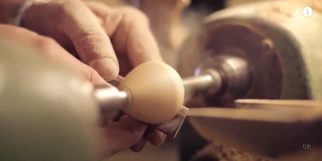
Does it really matter that Architectmade toys are now made in China? Morten Jensen, says “China is eager to learn about the quality and level of work of traditional Danish craftsmanship.” and continues, “The key to the wooden toys is although the products are handmade you should not be able to see that they are handmade. This is the perfection level both brands strive to achieve.” China has great respect for Danish design. They are using traditional methods of hand tooling, working in collaboration with the companies exacting standards.
The Rosendahl design group states, “Innovation, creative joy and respect for Danish design tradition – Our ambition is to profile and protect Danish design treasures by rediscovering classics – as well as creating new ones in keeping with Danish design tradition. The common denominator is products that make every day more beautiful and add value for our customers.”
As Graphic designer Paul Rand once wisely said, “Good design is good business.” Sustainability in the design industry is a huge environmental issue; perhaps the toys are more costly to these businesses using traditional production methods, but to the consumer only in the short term. I hope this answers the question, ‘Why we hate cheap things’. You never want to throw away these artisan toys they are passed down through generations. Overall good design brings us joy and therein lies its value.

Wednesday, June 10, 2020

National Theatre at Home: Jane Eyre

I’ll be married in this lilac gingham: you may make a dressing-gown for yourself out of the pearl-grey silk, and an infinite series of waistcoats out of the black satin.” Says Jane to Mr Rochester when he talks of ordering Chinese silks from London for a beautiful wedding dress. Mr Rochester pauses and smiles; a few audience members laugh and so we begin.

Jane Eyre recorded live from the National Theatre via YouTube directed by Sally Cookson is sublime! This is the first time I've seen a theatrical production online on screen, rather than at the theatre itself. I felt concerned that my suspension of disbelief through screen based media would be a little lost without the shared audience experience and emotional impact of a live performance; the feelings of anticipation, dread, joy, humor and despair. Would the distractions at home be problematic? I’d first thought. To get the most out of such productions on screen it greatly helps to have a really good speaker system at home to let the quality of this production start to work its magic. And as in the theatre or cinema ensure your mobile phone is switched off. There are so many elements worthy to mention... my breakdown of these are as follows.

From the magnificent Melanie Marshall in the scarlet dress that advanced the action of the story through song. I especially enjoyed her rendition of Noel Coward’s Mad About the Boy. Also to mention are musical scene transitions that overlaid key dialogue to further set the tone and pace and onstage during the production live musicians interwoven between these. I knew I’d love the story of Jane Eyre... the staging of sound is as masterly in construction to say the least.
The lighting of this production is another wonder and is a vivid contrast to the stage’s simplicity in design. At times it is so subtle that the scenes almost felt natural and the opposite would occur to transform the audience in either time or space; with the effect of twilight and beyond with over hanging spotlights looking like stars. Ceiling height hanging curtains formed both sides and backdrop, enabling the stage to be contained. As you can see from the pictures the changing colour transformations throughout the production from rich reds to blues to neutrals; hues and saturation greatly impacted the performance of both the scene and characters within, with an additional layer of lighting strategically placed behind; following the flow of the dialogue, characters still held their presence when lit in silhouette, a nod to the Victorian era. Such intelligent use of light and colour enveloping the stage and story! On stage levels of environs were achieved through a series of ladders and platforms mainly one upper and one lower interconnected, which were quiet daringly crossed at times by the actors. Nothing was lacking or added to the set other than a Chesterfield armchair for the great Master Rochester of course.
As often in theatre the limited cast play multiple roles throughout the production. I like that in costume even men were dressed as orphan girls. My only criticism is that I would have liked children playing these earlier scenes. Though I understand the practicality of late nights, repeat performances and traveling to name a few obstacles. Mr Rochester especially has a wonderful full bodied voice. His accent is spot on! Would I be wrong in saying that Felix Hayes’ Rochester is better than Fassbender’s... perhaps equally commendable, indeed this play likened emotionally to the 2011 film version. Jane’s vulnerability comes out in long monologues, which are very eloquently and passionately performed by Madeleine Worrall. During camera closeups which would not occur had I been seated live... she is utterly captivating. Her actions and facial expressions are indeed as alive as the drama itself. Her limited wardrobe in contrast to film productions neither limits her identity nor personal character’s growth.

The stage directions and dialogues are just as in Charlotte Brontë’s book. The passion and fire is palatable between Jane and Rochester. They were supported extremely well with other cast members as I have mentioned playing more than one role, though I have not done justice to. The lighting, the music and the story are superbly reimagined. My lasting thought is that I can not imagine what Jane Eyre was like seeing live in the theatre... this screen based performance is undoubtedly a different experience... though still worthy I am sure.
The National Theatre has been uploading free full-length plays every Thursday.
Donate and share the joy of theatre with everyone

Wednesday, April 01, 2020

India with Howard Hodgkin

Come into the Garden, Maud
The joy and energy in the paintings describes the artists journey; in this documentary Hodgkin’s becomes our guide. 

A Picture of the Painter Howard Hodgkin documentary celebrates Howard Hodgkin’s 50 years of painting exhibition at The Irish Museum of Modern Art, Dublin 2006. The documentary is filmed in a most magnificent location; the large bustling Indian town square in Fatehpur Sikri meaning ‘City of Victory’ UNESCO’s ghost town. Seeing the documentary on screen, is pure escapism. I can see the meditative and ponderous powers on the imagination of the ineffable grandeur preserved, as a backdrop to local people going about their everyday lives, notably the Indian women and children are dressed in a vivid range colours, interacting with each other through work and discourse; creating an array of visual colour and compositional arrangements that Hodgkin keenly observes and admires.
 Indian Sea
 Green Monsoon
 Sad Flowers
The city itself was founded as the capital of Mughal Empire in 1571 by Emperor Akbar almost 10 years later due to the lack of an adequate water supply, the town was abandoned and the capital moved to Lahore in present day Pakistan. In observing everything from the Mughal architectural splendour, the warmth of the desaturated pinkish hue façades to the sunset sky, the sun lowering in the delicate orange sky projecting sharp beams of light on the touching the tips of the architectural domes that are symmetrically balanced around the square. The sights and sounds of people gathered working, talking, and singing, playing instruments does not look like a ghost town, but rather an everyday place that is not every day, that fortunately is not inundated with tourists, due to the Taj Mahal being an hour’s distance away.

Julian Barnes describes a Hodgkin painting he has at home featured in the documentary as being ‘a blazing picture of complete joy, with a hint of green grey undertones that could symbolize melancholy.’ There is not much sadness to see, the joy and enthusiasm of orange in the painting below titled Keep it Quiet is fantastic. Dynamic brush strokes give the illusion of depth with their disrupted and blurred edges. If you asked Hodgkin’s what a painting means he’ll avoid explaining; as it’s very difficult to do so working from his nervous system from a moment or memory. This doesn’t deter Alan Yentob and us as the audience for seeking further explanations. We are met with Hodgkin’s evasiveness; it is here we bond with both the artist and interviewer, consequently the lack of explanation enables the viewer to interact with the pieces respectfully and mindfully.

The titles such as Rain, Sad Flowers, Keep it Quiet, are a few mentioned subjects of the pieces, and sometimes these subjects can be literal or ironic and coincidental. Julian Barnes quotes, “When travelling with Howard he and have a running joke occasionally sitting in a bar or relaxing in a restraint, staring at a sunset, gazing at a piazza. He will say with a delivery poised between self-satire and true contentment… I feel a picture coming on. I richly reply I feel a novel coming along. He means it more than I do, well I never mean it. And I often wonder what is happening inside his head at these moments. Howard looks intently all the time, but when he says he feels a picture coming on, he seems to be looking differently, the moment is digestive, ruminant. And I know he will remember everything, that’s to say everything he needs; and will need.” If you love India, travel, and culture and want to feel a sense of departure from the everyday. Hodgkin’s paintings offer the most sublime respite.
Keep it Quiet


Monday, August 01, 2016

Picasso linocuts

Now showcasing at The National Museums, Lady Lever Art Gallery on loan from The Department of Prints and Drawings, at the British Museum are these Picasso linocuts. Produced in the early 1960s when he was 80 years old. Both Picasso and Matisse were known to work with lino printing making, the linocut thereafter was considered an established professional print medium.

What makes these perhaps a little more remarkable is the method behind the printing process known as the reductive print method, painting in layers building up the colour and textures onto a canvas. A single piece of linoleum is used and worked into further and further with each colour. The lino was cleaned and reworked with further details with each colour added, in addition to the background paper showing through in the design. In order to produce multiple prints, each colour would be printed about 50 times, as with the final cut there’s no going back, apart from doing a highly detailed black and white also to note with this technique is that there’s no margin for error. The plus point is that the print registration was easier to achieve, also the image could be worked on more easily as a whole. Previous methods used separate lino blocks for each colour, this could produce more pieces in a future run, but registration was a little more tiresome and the image composition on separate colour layers is perhaps more difficult. A piece of lino is far from transparent like the stacking order of layers used in photoshop and key-frame animations made on semi-transparent papers.

It’s interesting to see how Picasso’s final piece evolves from the base background to each colour added separately and superimposed and concluding with the final black and white and colour piece. The single colour pieces are bold and striking. It shows a certain kind of confidence and creative thinking that pushed the lino printing method into the world of multiples of colours, in a technique that puts artistic expression before the process of production. Yet, makes us appreciate the print production process more fully by showcasing all the pieces that make up the final colour composition with equal importance, unfortunately online here are just a few of the prints a total of 17 are made up just of these designs.
Prints featured
  Femme nue à la Source
Jacqueline Lisant
Nature morte sous la lampe

*********
Further Reading

Monday, June 06, 2016

E.A. Séguy

E.A. Séguy was a rather elusive French character of the early 20th century, he doesn’t even exist on Wikipedia or at least there’s a mix-up online between him and Eugène Séguy. Eugène Séguy was a zoologiste et entomologiste with a very similar name and entomological background, rather than E.A. Séguy officially known as Emile-Allain Séguy (1877-1951) was a painter and entomologist. Important to note is that he has been credited with authentic authorship by the Met Museum and Christie’s Auction House. His studies produced many published illustrated editions, showcased below are two of his most renown, colourfully illustrated books titled Insectes and Papillons respectively — are said to be inspired by Art Nouveau and Art Deco of the 1920s/30s, which is when about they were published and indeed a great source material for textiles of that period. Insectes is detailed with a vast amount of technical illustrations of the species, especially dragonflies and damselflies, beetles and wasps with magnificent fine jewel-like wings, iridescent colouring and geometric patterns in the composite designs. Papillon’s dedicated study includes 81 varieties and 16 amazing composite textile pattern designs, using the same process of pochoir and lithograph printing as the other publication with the same stunning masterful illustrative style.

Pochoir printmaking is a method adapted today by graffiti artists and previously Henri Matisse. Firstly, detailed stencils plates of either card or thin copper sheets are created. Each, inked up with different colours and placed strategically into position, what’s quite remarkable is the number of stencils used, and the precision placement involved; he likely worked with more than one assistant throughout this process. Additionally, colour matching would have been recorded as so to produce reproductions accurately. These fine prints in limited editions are still sometimes obtainable as individual prints are priced of about £2,000 today through Christie’s Auction House.

It is said that he described his illustrations as “un monde somptueux de formes et de couleurs” (a world of sumptuous forms and colours). Perhaps with the aid of the microscope he was better able to examine the smallest of subject matter. Actually observing the absurdly striking colours, forms and pattern detailing of each studied species. Also worth mentioning is the arrangement and grouping of the varieties of insects into pleasing compositions within the publications design format. It is ironic that there is confusion over his accreditation, perhaps E.A. Séguy would be most amused — as in the insect world, there are no precise and easy ways to tell butterflies, moths and other like insects apart.

*********
Further Reading

Tuesday, May 31, 2016

Statement wallpapers

Wallpaper seems to be fashionable again in the world of interior decoration with boldness, simplicity and contrasting designs on statement walls. It’s time to consider the most popular designs of 2016, as many other designs could be inspired by these current trends. Using Google images as a reference I’ve been able to make a better judgment call. Some of the designs feel slightly alien to me as wallpapers, whilst others look rather nice only as swatch designs. In the end, only two out of the ten made the cut, two others inspired potential DIY projects, below is a little reasoning sometimes very limited to explain my decision process.
Jungle lé2, €75 (£60) a roll, petitefriture.com

Well this is something … and it’s not at all apparent what exactly until seen on a feature wall (URL above), the eyes feel completely lost in that swatch, but there’s no doubt that this is a beautifully illustrated design and a lovely way of bringing the exotic outdoors into a modern city living space. The design online is featured in a Parisian furniture boutique. I wonder if the repeat would be too contrived for this subject matter used in a large area? I rather like the inky blue colour choice; it’s a good contrast from its inspired natural origins, the outline graphic style creates a sense of freshness and sophistication.
wood plank stripe, £12 a roll, diy.com 

Can you believe this design is the Editors pick … It is awful! So much better to reclaim old wood from a skip and apply fresh paint colour, probably as cheap to install without the cost of it looking so.
One Day, £55 a roll, minimoderns.com

The title of the design is difficult to disassociate from the film: One Day, set in 1988. It was lost on Google images, although a worthy Editors pick. I like the colours of this design and the appealing motifs, but as for being inspired by kitchen sink dramas of the 1950s and 1960s well… (URL above) There’s no impression of bleakness or emotional struggle, with motifs of steaming kettles or a chair askew. Everything is precision perfect. Perhaps a new title is needed, a street name? The piece does contain many visual references to the 1950s and 1960s. The window frame design is a nice concept and I do like the way that the motorbike, pram and rounded window have added a lovely sense of interest to the negative positive space.
Lempicka, £64 a roll, osborneandlittle.com

The name of this design is associated with the artist Tamara de Lempicka. The rich red and gold design perhaps does give off an air of modernity. I would have preferred something a little more sensual and dynamically composed as the repetition of these cylindrical motifs is a little hard to take.
Marvel Superheroes, £8 a roll, wilko.com

The vintage comic book covers attempt to come to life, an offset design with images from Thor, Spiderman and the X-men with dynamic action styling and mainly bold primary colours. I noted that this is a popular choice online with other comic formats. I’d prefer a more cut and paste DIY approach, but I like the idea of a story being unfolded on a large scale! The comic book covers in this design, however, are less impactful because they don’t reveal the stories.
Entering The Hammam, £50 a roll, firedearth.com

I thought it was interesting that the repeat design was formatted in offset squares as the swatch looked randomly composed. The design is a little overpowering as a wallpaper, though I like that that design has some geometric shaping to its layout, the cast iron blackness of the keys feel a little cold as an interior design choice.
Flamingo, £12 a roll, diy.com

How can flamingos and palm trees be pasted onto a battleship grey background? It feels very alienating. Undoubtedly the subject matter does seem to be a popular interior choice for 2016, but where’s the magic, the whimsy, the love in this design? … a missed opportunity for sure.
Hydrangea, £20 a roll, cathkidston.com cathkidston.com

Not as popular on Google as I thought it would be, behind bookcases yes on walls it doesn’t compare to the original 1980s Laura Ashley designs. That’s if you like floral.
April Showers, £28 a roll, scion.uk.com scion.uk.com

I think it looks sad, perhaps I am slightly influenced by having recently read the biography of Judy Garland and I love Judy, but this a no.
Bumblebee, £86 a roll, farrow-ball.com

My goodness, I didn’t see that coming at £86 a roll, and the most popular of the ten designs on Google images! It does come in an array of colours and often the bumblebee motifs are gold foiled quite rightly at that price! I have to say I love the design! It is simply elegant and there’s a perfectly balanced contrast between the motif and the background.

To conclude even though there are only ten designs it feels like a hard choice to make, if the price was no object as I am judging these only from a design perspective, I would have either the Jungle or Bumblebee as my Editors pick. Both these designs exceeded my expectations and surprised me — after all the home is where the heart is.
*********
Further Reading