author

By Nina J P Evans

Thursday, May 09, 2013

Finely bound novels by Jules Verne

From the Earth to the Moon, 1874 - cover by Henri de Montaut

I’ve recently seen the Technicolor Disney adaptation of Jules Verne’s Twenty thousand Leagues Under the sea, 1954. Starring James Mason as Captain Nemo and Kirk Douglas as the wayward man of great physicality aptly named Ned Land, even though he spends most of his time locked up on board the Nautilus, he was needed; if there was any chance at all of survival.

The book compared was fascinating in the minutiae of recorded details of the underwater ocean journey. Highlighting the voyages great academic appeal and at the same time the insurmountable sense of wanting to escape, when any given opportunity presented itself. The feelings of claustrophobia due to being imprisoned and being under the forceful control of the questionably sane Captain Nemo—made this adventure all the more exciting. It felt even more relevant to me because of the three mentions of Liverpool, then in its heyday of shipbuilding and merchant shipping. It even compared the inside decor of the Nautilus to Liverpool’s Adelphi Hotel. There is a lounge room that has the same blueprint design of the RMS Titanic first-class passengers smokers lounge. Also, The liner scene from Brideshead Revisited, 1981 television serial was filmed there too. Other than the architect, Jules Verne was the first to realise the nautical associations, though it’s vastly bigger inside compared to the Nautilus.

Here are some of Jules Verne’s first editions of his most well-known stories. French editor and publisher Pierre-Jules Hetzel commissioned illustrators Édouard Riou thought to be the most recognised, Léon Benett most prolific with Voyages Extraordinaire, and the very talented and teleologically advanced in printing methods George Roux. They are so beautifully ornate, often with symmetrical designs with limited colour palettes. Some of the worn cloth editions now look iridescent, as if… made from insect wings. The depths of the gold embossing for outline pictorial details, and ornate patterns form borders and backgrounds. The texture of the original cloth fabric, woven, echoes what lies beneath. I’m not sure today if any new book published could achieve this standard of craftsmanship, and illustrated with fine prints throughout. These finely bound illustrated novels are very collectable—Jules Verne was a prophetic and fascinating writer of the greatest adventures ever told.

From the Earth to the Moon, 1874
Voyages Extraordinaires series, Hetzel editions, 1875
Clovis Dardentor, 1896 - cover by Léon Benett
 Facing the Flag, 1876  - cover by Léon Benett
French first edition of Captain Antifer, 1894 - cover by Georges Roux
 Off on a Comet, 1877
 Mistress Branican, 1891 - cover by Léon Benett
 The Mighty Orinoco, 1898 - cover by Georges Roux
The Castaways of the Flag, 1900 - cover by George Roux
 Mathias Sandorf, 1885 - cover by Léon Benett
César Cascabel it is part of Voyages Extraordinaires series, 1890 -
cover by Georges Roux
 Map of route through Alaska
 Map of route through Russia
Journey to the Centre of the Earth, 1871 - cover by Édouard Riou
Cover of the French first edition of Around the World in Eighty Days,
1873 - cover by Alphonse-Marie de Neuville and Léon Benett
A walk under the waters
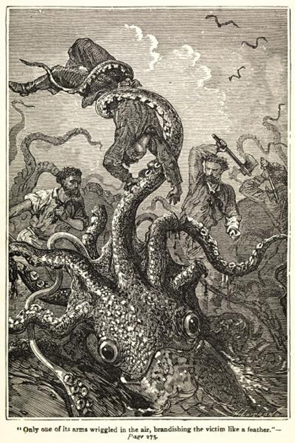
Illustration showing giant squid attack
Frontispiece to Twenty Thousand Leagues Under the Sea 
Twenty Thousand Leagues Under the Sea, 1870 - cover by Édouard Riou

Wednesday, May 08, 2013

Art Forms in Nature


Here are just a few visual pieces from this accomplished scientific artist and illustrator Ernst Heinrich Haeckel, 1834-1919 (he was also known as a German physician, biologist and nature philosopher), his work bridges the gap between the scientific study of nature with art. His wonderful illustrations particularly remind me of Jules Verne’s book published in 1870. Jules Verne was likely inspired by these for this novel: Twenty Thousand Leagues Under the Sea, with Captain Nemo in his electrical powered submarine the Nautilus, Captain Nemo and his divers had collected different zoological species from around the world; particularly from the bottom of the seabed. This work shows that same sense of obsessive fascination and discovery and is fanatical in every detail, symmetry and design. The illustrations below are from his most noted book titled: Art Forms in Nature or Kunstformen der Natur published 1869, a production of 100 published illustrations.

Other illustrated editions include: Radiolaria (1862) Siphonophora (1869) Monera (1870) Calcareous Sponges (1872), As well as several Challenger, reports: Deep-Sea Medusae (1881) Siphonophora (1888) Deep-Sea Keratosa (1889) Radiolaria (1887)—illustrated with 140 plates and enumerating over four thousand (4000) new species. [37]

In addition to the above, illustrated books he also published extensive writings. I can’t help thinking that like Walt Disney who didn’t give credit to illustrators and animators for their involvement with his early films.  Haeckel in the later position of being a professor at the University of Jena, working there for 47 years from 1862 to 1909. As the dates coincide with the book's publications, my guess is that under his direction he utilised his students in order to create these awe-inspiring visual compendiums. However, that doesn’t subtract from the genius of the man orchestrating these most visionary books! It is well known that many great artists have had a highly skilled team as assistants.

This in-depth visual zoological study of animals and sea creatures is intriguing and surprising. His work also supported Charles Darwin’s 1859 book On the Origin of Species. Wiki quotes: “From 1866 to 1867, Haeckel made an extended journey to the Canary Islands with Hermann Fol and during this period, met with Charles Darwin, in 1866 at Down House in Kent, Thomas Huxley and Charles Lyell.” and furthermore “One of Haeckel's books did a great deal to explain his version of "Darwinism" to the world.” These were the times of Journey and discovery… I can only marvel at the volume and complexity of the illustrations published! Thankfully, they were not exclusive to scientific research and readership with special thanks to Jules Verne and others equally fascinated. Haeckel’s book Art Forms in Nature along with the wondrous photographs by Karl Blossfeldt were a seminal influence to the designs and architecture of the Art Nouveau 1890-1910; inspired by curved lines, flowers and plants and natural forms.


Monday, May 06, 2013

The monkey puzzle tree

To quote Wikipedia: “The origin of the popular English name Monkey-puzzle derives from its early cultivation in Britain in about 1850, when the species was still very rare in gardens and not widely known. The proud owner of a young specimen at Pencarrow’s gardens near Bodmin in Cornwall was showing it to a group of friends, and one made the remark, ‘It would puzzle a monkey to climb that!’ as the species had no existing popular name, first ‘monkey puzzler,’ then ‘monkey puzzle’ stuck.”

Sunday, May 05, 2013

Three Things You Need to Know About Rockets


Meeting Jessica Fox (after recently reading an article about her as part of World Book Day 2013) was delightful. She was giving a talk about her debut novel: Three Things You Need to Know About Rockets (based on her own love story). At The Bluecoat Chambers, Liverpool as part of the ‘In Other Words,’ Literacy festival. She told us about how she gave up her job working for Nasa in sunny California, to co-run a used bookshop in Scotland with her partner in a literacy village of Wigtown; where there are 12 other bookshops and a village of 1,000 residence by the sea, which she compared to her high school in LA with 1,800 pupils.

It was funny hearing her stories about her customers, sometimes finding their way into her living quarters. And, the layout, in order to get out of the TARDIS like property she mentions “you have to walk through the bookshop each time.” She says “people have seen me in different moods and very sickly a few times”. She’s gorgeous, her American vanity is hilarious. She said that another bookshop near hers has just closed, and is up for sale. No one in the audience jumped up ready to take on such a thing! At question time we were speaking about the value of books as objects, compared to reading e-books. An elderly guy in the audience said how he went to Shakespeare & Co in Paris, and stayed there, and did readings when old American George Whitman was the proprietor. He didn’t go back again to Paris for another 30 years by then George was very old indeed. But when the two met again George remembered him and shook his hand; you could hear from his voice that he felt a little emotional. To sum up, he said, “the relationship with a bookseller is not something that you can purchase online.”

I have a romantic ideal in my head about Jessica’s story as there are so many parallels to the film Notting Hill, starring Hugh Grant as a proprietor of a travel bookshop, near Camden Lock Market. The shop is painted cobalt blue the same colour as the background to Marc Chagall’s La Mariée; which is referenced in the film. Writer and director Richard Curtis describes the concept of the film: “The idea of a very normal person going out with an unbelievably famous person and how that impinges on their lives.” I especially like the space scene as a metaphor for Julia Roberts character needing personal space, in contrast to Hugh Grant trying miserably to get over her. He and his flatmate, Rhys Ifans watch a Film starring Julia Roberts, what could possibly be worse, other than having Rhys Ifans company offering little comfort whilst seeing the love of his life starting as a space commander—is just a brilliant filmic moment!

Maybe this book will launch Jessica Fox’s career as a writer and bookshop owner, or there’ll be a film adaptation of her story. She may have left Nasa behind, but she is still reaching for the stars!


Saturday, May 04, 2013

Colour Quotes

Ceiling of the Paris Opera, 1963

“In our life there is a single colour, as on an artist’s palette, which provides the meaning of life and art. It is the colour of love.” ~ Marc Chagall

“Colour has always got something mysterious about it that cannot be properly understood… Colours are the most irrational element in painting. They have something suggestive about them, a suggestive power…” ~ Paul Klee

“Colour is a means of exerting a direct influence on the soul. Colour is a keyboard, the eyes, the hammers and the soul is the piano with many strings. The artist is the hand which plays, touching one key or another purposively to cause vibrations in the soul.” ~ Wassily Kandinsky

“Above all keep your colours fresh!” ~ Edouard Manet

“They’ll sell you thousands of greens. Veronese green and emerald green and cadmium green and any sort of green you like; but that particular green, never.” ~ Pablo Picasso

Place Clichy (Bouvet 88; Roger-Marx 77) 1922

“You reason colour more than you reason drawing… Colour has a logic as severe as form.” ~ Pierre Bonnard

“Colour does not add a pleasant quality to design—it reinforces it.” ~ Pierre Bonnard

The Red Room (Harmony in Red), 1908 

“Colour helps to express light, not the physical phenomenon, but the only light that really exists, that in the artist’s brain.” ~ 
Henri Matisse

“There is a logic of colours, and it is with this alone, and not with the logic of the brain, that the painter should conform.” ~ Paul Cezanne

“We get used to a certain kind of colour of form or format, and it’s acceptable. And to puncture that is sticking your neck out a bit. And then pretty soon, that’s very acceptable.” ~ Lee Krasner

“Colour is my day-long obsession, joy and torment.” ~ Claude Monet

No.9 (Dark over Light Earth), 1954

“I’m not an abstractionist. I’m not interested in the relationship of colour or form or anything else. I’m interested only in expressing basic human emotions: tragedy, ecstasy, doom, and so on.” ~ Mark Rothko

“Colour is crucial in painting, but it is very hard to talk about. There is almost nothing you can say that holds up as a generalization, because it depends on too many factors: size, modulation, the rest of the field, a certain consistency that colour has with forms, and the statement you're trying to make.” ~ Roy Lichtenstein

“In visual perception a colour is almost never seen as it really is —as it physically is. This fact makes colour the most relative medium in art.” ~ Josef Albers

“The craving for colour is a natural necessity just as for water and fire. Colour is a raw material indispensable to life. At every era of his existence and his history, the human being has associated colour with his joys, his actions and his pleasures.” 
~ Frenand Leger

“Instead of trying to reproduce exactly what I see before me, I make more arbitrary use of colour to express myself more forcefully… To express the love of two lovers by the marriage of two complementary colours…To express the thought of a brow by the radiance of a light tone against a dark background. To express hope by some star. Someone's passion by the radiance of the setting sun.” ~
 Vincent van Gogh

Suaire de Mondo Cane, 1961

“Colour is sensibility in material form, matter in its primordial state.” ~ Yves Klein

“In nature, light creates the colour. In the picture, colour creates the light.” ~ Hans Hofmann

“Art is harmony. Harmony is the analogy of contrary and of similar elements of tone, of colour and of line, conditioned by the dominate key, and under the influence of a particular light, in gay, calm, or sad combinations.” ~ Georges Seurat

“We were always intoxicated with colour, with words that speak of colour, and with the sun that makes colours live.” ~ Andre Derain

Pink Tulip, 1926

“I found I could say things with colour and shapes that I couldn't say any other way—things I had no words for.”  ~ Georgia O'Keeffe

Friday, May 03, 2013

A Visual Archive of Colour Systems

Interpretation of Pythagoras teachings by Aristotle 350BC
These colour systems are arranged in chronological order, starting with Pythagoras (350BC) and finishing with Wilhelm Ostwald (1916), rather than give further explanations, I’ve included all my references below. The colour wheel is something that most students of art take as a given, whilst studying the principles of design; it teaches us about colour values, hues and saturation but also there’s colour interaction, colour temperature and colour schemes that are greatly aided by using these colour systems. The invention of these systems is jointly credited to A.H. Munsell and Newton who shared the concept of liking colour notation to music notation. “In his original color wheel (1704), Sir Isaac Newton included musical notes correlated with color beginning with red and dividing the circle by the musical scale starting with D and ending with the octave of D.” This is a study of the visual history of colour systems. If I said that they were intelligently designed, it would be an understatement! They illustrate a variety of visual solutions; that show the true complexity of seven colours, in terms of light theory, and how we perceive colour.     

Plato 350BC
Aguilonius, 1613
Robert Fludd, 1629
Richard Waller, 1686
Sir Isaac Newton, 1704
Tobias Mayer, 1745
In his work Natural Colour System, Moses Harris, 1766
Johann Heinrich Lambert, 1772
Ignaz Schiffermüller, 1772
Colour vision and the wave theory of light by Thomas Young, 1809
Later adopted by the Bauhaus by Otto Philipp Runge, 1810
Six colours, minus the indigo by Johann Wolfgang von Goethe, 1810
Colour circle arranged like rose petals by Charles Hayter, 1830
Chromatic researcher George Fields, 1841
Developed Newton’s colour circle, Hermann Günther Grassmann, 1853
Michel-Eugéne Chevreul, 1861
Hermann von Helmholtz, 1867
Charles Blanc, 1867
The first colour cube was created by William Benson, 1868
Wilhelm von Bezold, 1876
Inspired by Fields’ colour circle, illustration by Irozu-Mondou, 1876
Ewald Hering, 1878
Charles Henry, 1889
Colour chart evoking flower petals by Charles Lacouture, 1890
Hermann Ebbinghaus, 1893
Colour-mixing apparatus by August  Kirschmann, 1895
Divided colour space into hue, lightness, and chroma: Albert Henry Munsell, 1905
Wilhelm Ostwald, 1916
Inspired by Wilhelm Ostwald’s colour system in the 1940’s.

Special Thanks to: